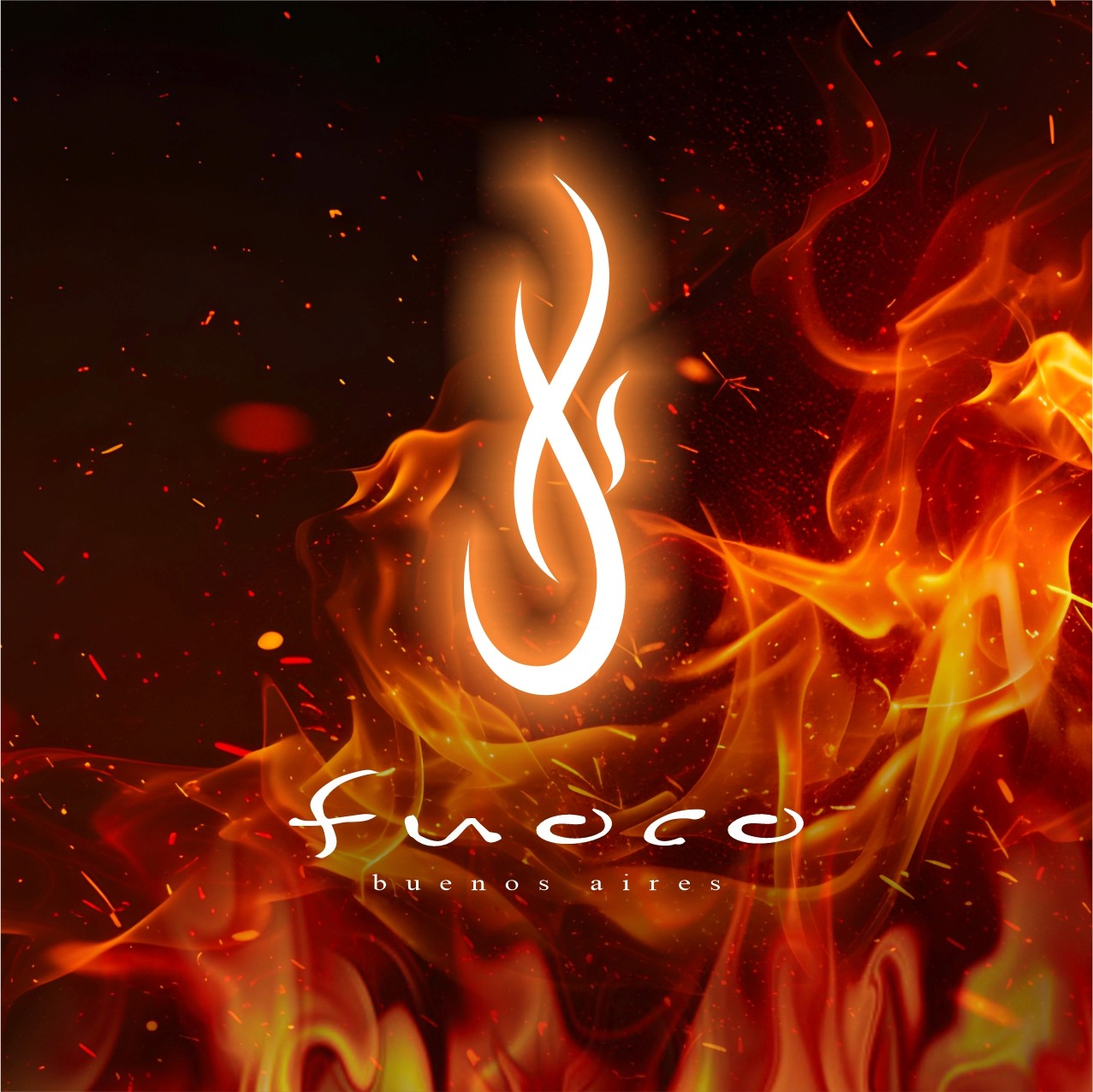
Case Study 04:

di Fuoco

Di Fuoco is a conceptual brand project exploring identity, emotion, and sensory experience through visual design.

The project focuses on building a cohesive visual language inspired by the concept of “fire” as energy, transformation, and expression. Through color, typography, and graphic elements, I aimed to create a strong and consistent brand identity that can extend across multiple touchpoints.

This project reflects my interest in developing scalable visual systems and translating abstract concepts into meaningful brand experiences.

Category:

Identity & Print

Client:

di Fuoco

Duration:

3-4 Weeks

Location:

Buenos Aires, Argentina

fuoco Identity
fuoco 1
Card
Ecobag
arambeck© 
(arambeck® — 01)
Architecture + Design
arambeck© 
Architecture + Design
arambeck© 
Architecture + Design
arambeck©
Architecture + Design
arambeck©
Architecture + Design
arambeck©
Architecture + Design

FAQ.

Clarity is the Blueprint: Defining success with Precision.

01

What services do you offer?

02

What is your typical turnaround time?

03

Do you only work in 2D projects?

04

Can you handle both design and build?

05

Do you offer brand strategy too?

06

What’s your process like?

What services do you offer?

What is your typical turnaround time?

Do you only work in 2D projects?

Can you handle both design and build?

Do you offer brand strategy too?

What’s your process like?